Debit & Credit User Guide
Mac App Interface
The Main Parts
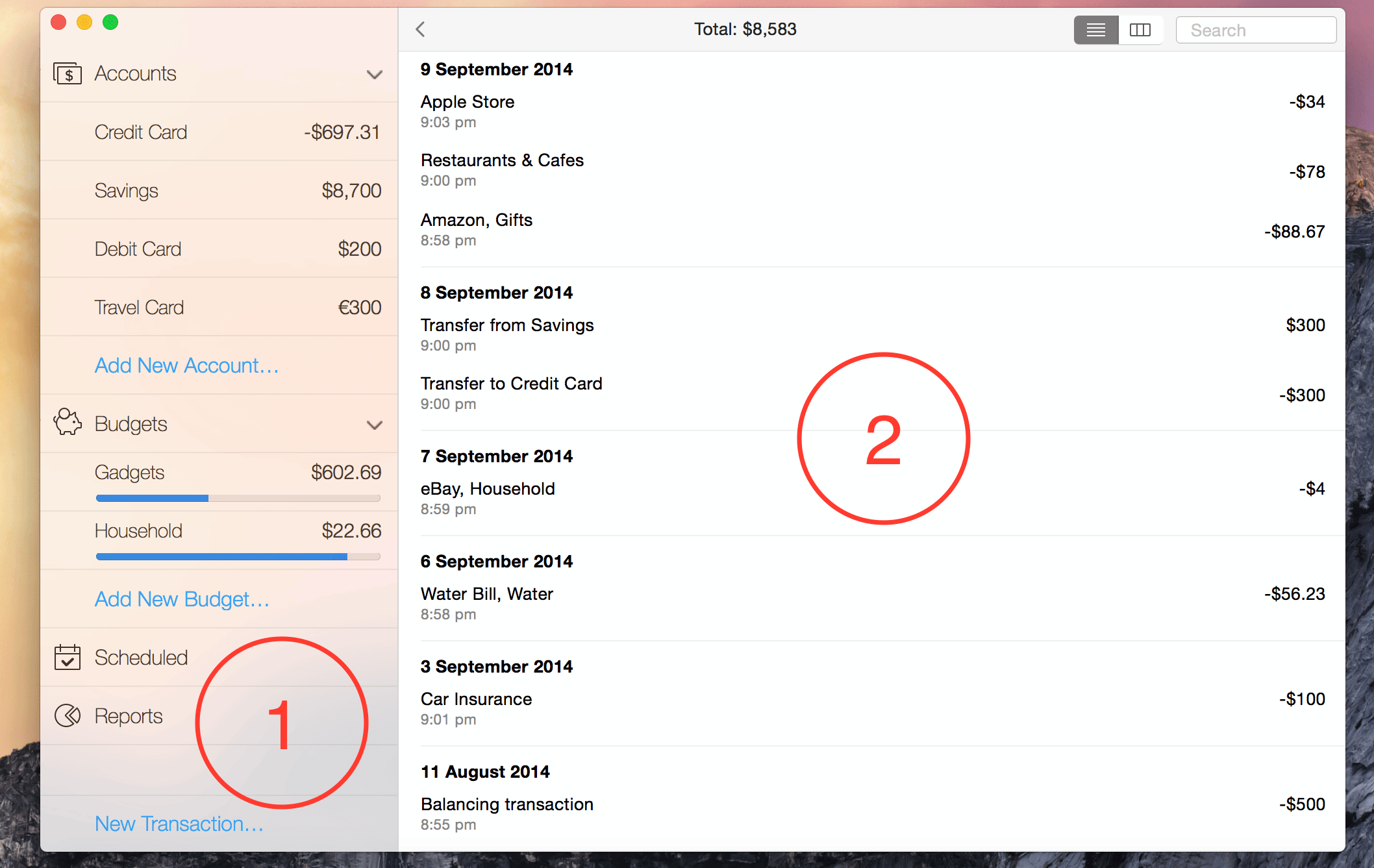
The interface of the Mac app consists of the following two parts:

1 - The sidebar on the left side. It is always visible and it is used to navigate through the main sections of the app.
2 - The detailed view. It will be different based on the currently selected section in the sidebar.
Regular View vs Table View
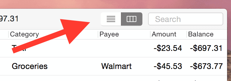
You can switch between those two modes by clicking on the following button in the upper-right corner:

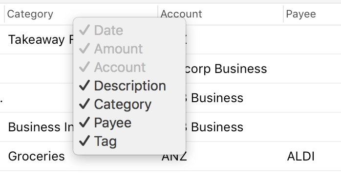
The first view mode allows you to have a concise list of your transactions where the app will decide what information to display about each of your transactions. The table view mode, however, is designed to display as much information as possible and is highly adjustable. You can change the order of the table columns if you want. You can also disable some of the columns by right-clicking the table header:

Badges
At some point you might see numbers in badges next to your budgets and scheduled notifications in the main menu:

These numbers indicate how many overspent budgets and overdue scheduled transactions you currently have.
Related topics: creating accounts, general information about transactions, iOS App Interface.